
Behavior Therapist Portfolio
Swathi Mangu, my mother, is a behavior therapist who has been working with children with special needs and their parents for six years. She has done incredible work through multiple organizations, earned a master's in psychology at 39 years of age, and works passionately every day to improve lives.
She always told me she wanted a platform to showcase her work and share her knowledge. When I showed her a demo wireframe to get an idea of what the product could be, she loved it.
After we decided to fully pursue this, I delved into research.
Research
Before diving into design (and development), I needed to understand my potential users' needs. I Googled relevant terms like "behavior therapists" and visited websites of established behavior therapy institutes to get an idea of industry practices. This was necessary because my exposure had been limited to technical websites, and I needed real-world examples for storytelling purposes.
Observations
Here are the key observations I made:
- Websites relied on fun interactions to keep users engaged
- Vibrant colors were used to synonymize with a child's energy and playfulness
- Metrics were shown which was a seamless way to help users understand
- how the services actually work
- why their services are reliable
I wanted to incorporate these ideas into my process while aligning them with my client's needs.
Goals
Before starting the actual work, I wanted to outline goals and prioritize tasks. After discussing with my client, she listed the following needs:
- A way for potential clients to discover her and make contact
- Showcase her work, talent, and services
- Display parent testimonials
- Highlight how she stands out from others
These goals were straightforward and easy to approach. By writing compelling content and creating an attractive, engaging website with good SEO, all goals could be met. For the engaging part, I knew I needed the help of storytelling.
Storytelling
During the design process, I struggled with how to present the information effectively. My usual approaches felt boring, and I wanted something more engaging. Then I watched "Using storytelling to capture your audience and create an engaging digital experience on the web" by Chiara Aliotta. This helped me decide on a direction for the website and understand the importance of design language.
Initial Designs
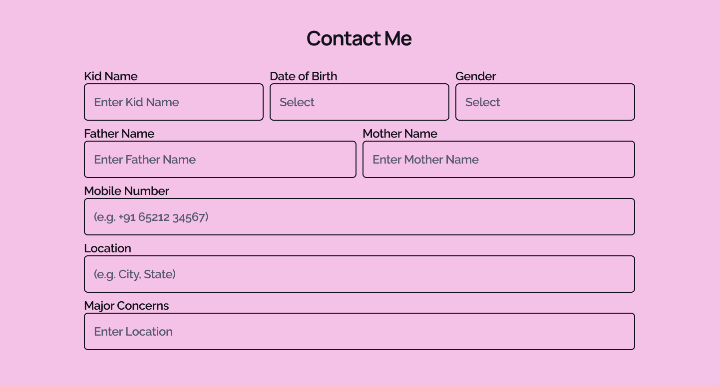
I started my design with the contact section because I learned from another YouTube video that it's better to begin with the most important elements rather than following a chronological order starting with the hero or navigation bar. I created a simple contact section with the necessary fields.
Then I moved on to create a basic header, footer, hero section, about me, services, and recent blogs. There was nothing special about the initial design, except for the design language taking shape in the most basic ways.
After establishing a basic layout, I began the development process, and the design started to evolve.
Design and Development
I approached the design and development of the website simultaneously, working on one component at a time. Figma can be helpful sometimes, while other times, Tailwind CSS is more useful. What works in Figma might not translate aesthetically in the browser. So, I try to spend less time in Figma—just enough to get the idea of what I want—before jumping into code. That's the approach I took this time, in the following order.
Core Idea
When transitioning from wireframe to design, I wrote three words in Figma:
playful, imperfect, free
I wanted to keep these ideas in mind while designing. I needed to develop a design language that reflected these concepts, which I believe I achieved. I chose the Catppuccin Mocha color palette and made it as colorful as possible. I knew I'd use Manrope as my font because I love it and it fits my use case well. I needed a good pairing to go with it, and after some research, I found my second font: Raleway. They worked great together. My client didn't want a dark mode option, so I was excited to showcase the influence Neubrutalism had on me. It was a great experience bringing together ideas about how it should look and feel aesthetically before moving on to coding.
Contact Me
I identified this as the most crucial section since it's where I'd need to guide users. All the presented information would lead to this part. So, I decided to develop this first. After recreating the design, I realized we needed two forms depending on whether the consultation was for a child or an adult. I added a dropdown to select child or adult, and the form elements change accordingly.
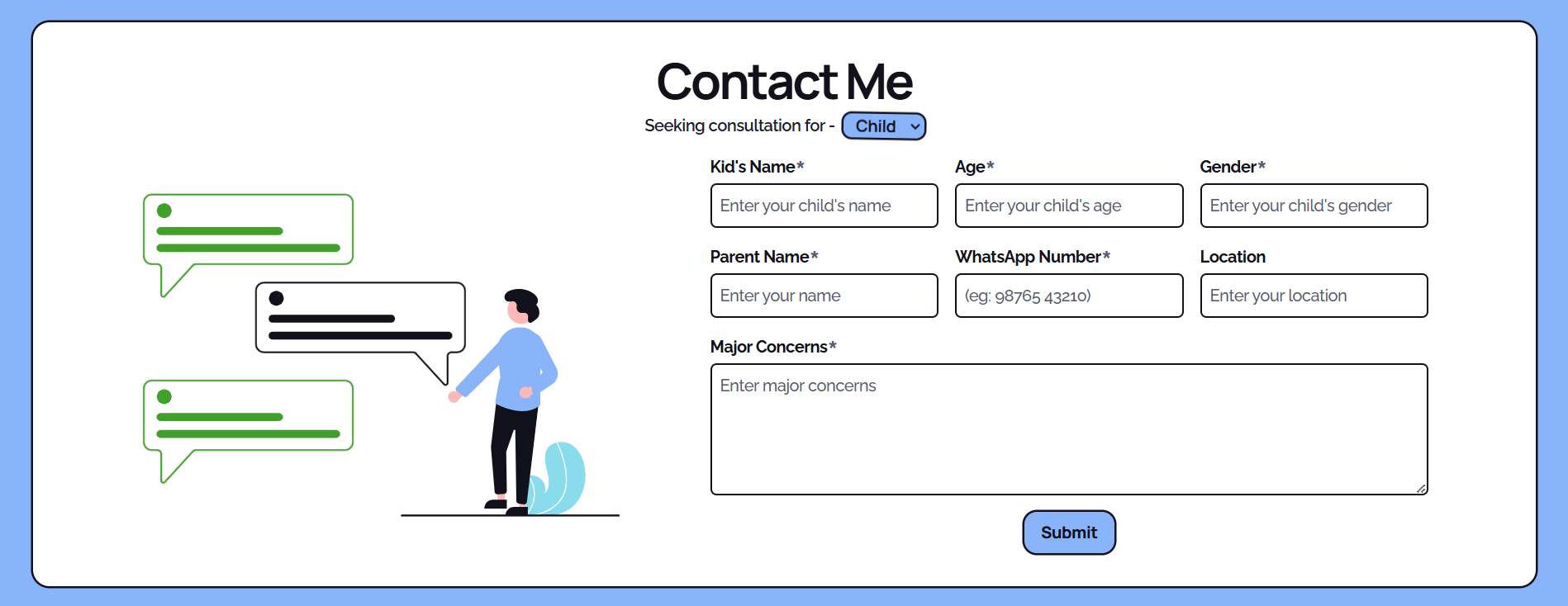
The client requested immediate notification upon form submission. I researched tools to provide this functionality and found EmailJS to be the ideal solution. It offers an easy-to-use SDK, REST architecture, comprehensive documentation, and a user-friendly dashboard. After implementing EmailJS into the form, she now receives an email instantly when someone submits their information.
Header and Footer
I created a basic header and footer while developing the contact form to get an idea of how the form would look, and later filled in the details.
The header needed to contain the client's name, a logo, and links to the website's sections and pages. I added the name and links with placeholder URLs until the sections were created. Then I designed the logo. My mother told me that puzzle pieces are often used to represent autism, and I had seen during my research that many other companies use this symbol too. So, I created a logo using puzzle pieces in Figma.
![]()
For the footer, I included an "all rights reserved" text, links to her social media, and a scroll-to-top button. It was straightforward and didn't require much deliberation.
Hero
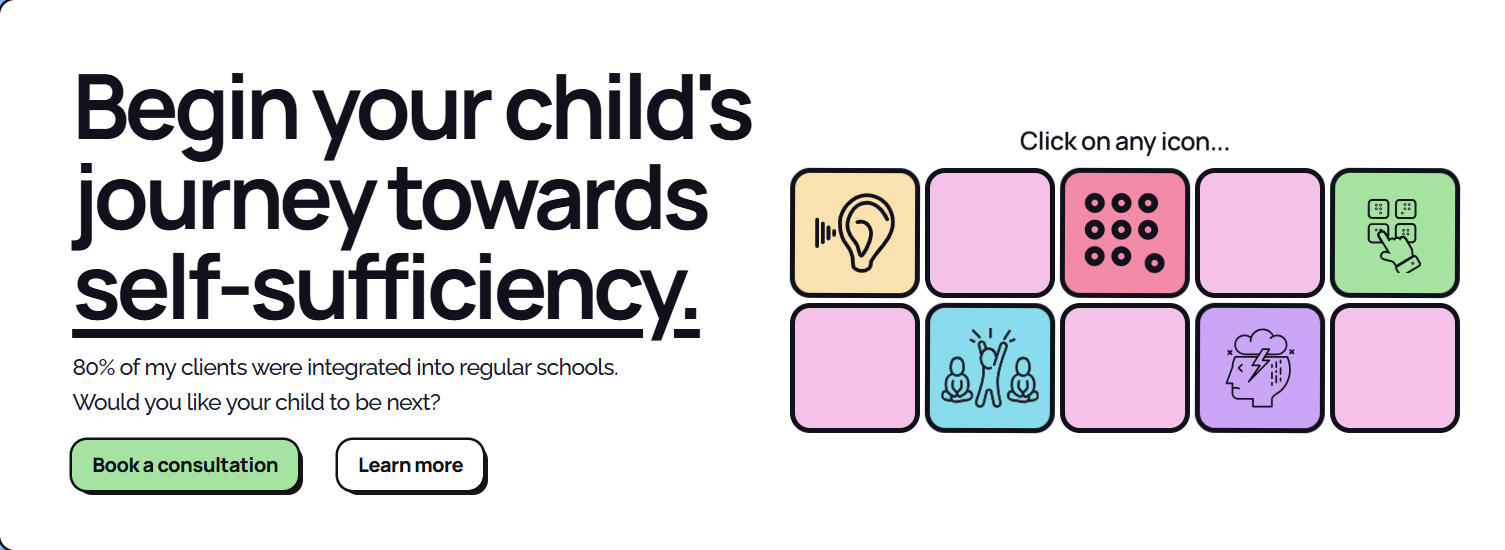
The hero section is the first thing users see when they visit the website. I knew it had to be attention-grabbing with clear, concise text. I spent considerable time crafting a compelling headline and tagline. I'm really proud of what I accomplished here:
Begin your child's journey towards self-sufficiency.
After placing the main text on the left, the right side felt empty. I knew I needed to add something visually interesting, but I wanted it to be functional too. So, I sketched a few little squares in Figma and developed a design. While translating it to code, I had the idea to include relevant icons in the squares that could link to blog posts. I always find coming up with ideas to be the challenging part; implementation is usually straightforward. After finalizing the design, I added a subtle wiggle animation to indicate that the elements are interactive. Here's the final product:
About and Approach
These sections were straightforward. My client provided all the information about herself, and I organized it into relevant sections, ensuring smooth transitions between them.
Services
This section initially presented a challenge. My client offers four services, and I wanted to highlight two of them: Parent Training, which is unique to her, and Online Therapy, which she wants to focus on more. These needed to stand out. Since I couldn't make these two visually larger while maintaining coherence, I chose to use different colors. When I showed her the design, she asked if it is possible to make the information visible only when the user wants it to be visible. So, I used accordions from shadcn-ui and styled them to fit our needs.
This approach aligned well with our theme of imperfection!
My mother works towards self-sufficiency in a kid, not perfection. She believes every kid she takes responsibility for should be able to stand on their own without the support of others, despite the difficulties of being neurodivergent. I wanted the design language to reflect this, so I incorporated subtle wiggle animations, tilted pictures that straighten on hover but tilt again after, and other similar elements. The shifting layouts contributed to this effect, which I decided to embrace. Since it fit the theme, I decided not to "fix" the shifting. It would have been as simple as changing flex-wrap to flex-nowrap flex-col lg:flex-row, but I knew I had a good theme going and wanted to keep it that way.
Testimonials
This was the final element I added. Initially, we collected testimonials from my client's customers and presented them in accordions within a shadcn-ui carousel. These were static at first, but I later made them dynamic and connected them to Supabase. I also added a form at the beginning of the carousel for users to submit their own testimonials.
Blog
Having worked with blogs for my personal projects, I knew I would use Contentlayer for this, so it wasn't a significant challenge. I simply followed the documentation to set up the blog. I utilized the Tailwind Typography plugin to enhance the appearance of the parsed text and created a straightforward blog display component to list all the articles. The real challenge, however, is getting my mother to consistently write blog posts!
Tech Stack
- Figma - for wireframing and design
- NextJS - React framework of choice for the website, as its SSR features provide speed and SEO benefits
- TypeScript - for type safety and improved developer experience
- Supabase - for storing testimonials in a database and adding new ones
- Contentlayer - converts MDX to type-safe JSON
Challenges and Learnings
Throughout this project, I encountered several challenges that provided valuable learning experiences:
- Balancing aesthetics with functionality: Ensuring the playful design didn't compromise usability.
- Content management: Implementing Contentlayer for efficient blog post handling was a new learning curve. Adding the necessary frontmatter was something I haven’t done before.
- Supabase: I never worked with databases before for my websites, so this was a fun new experience. Makes me excited for my future projects. Can’t wait to explore features like Auth and Triggers!
These challenges pushed me to improve my skills in both design and development, reinforcing the importance of user-centric thinking in web development.
Future Plans
As we move forward, there are several improvements and additions we're considering:
- Implementing comments for the blogs.
- Creating a resources section with downloadable materials for parents and caregivers.
- Developing a blog content strategy to regularly share insights and advice.
- Exploring the possibility of adding multilingual support to reach a broader audience.
Conclusion
This project was a journey of creativity, learning, and problem-solving. By combining my technical skills with my client's expertise in behavior therapy, we created a website that not only showcases her services but also embodies my design principles - playful, imperfect, and free. The process of designing and developing this site has been a rewarding experience, allowing me to apply various web technologies while creating a meaningful platform for my mother’s professional endeavors.
The website now serves as a powerful tool for my mother to reach and help more families, while also standing as a testament to the potential of combining personal passion with professional skills. As we continue to refine and expand the site, we look forward to its positive impact on both my client's practice and the lives of the families she serves.